Lumosity – Evolving the total brand experience for the #1 brain training app.

-
OBJECTIVES
Develop a clear brand architecture.
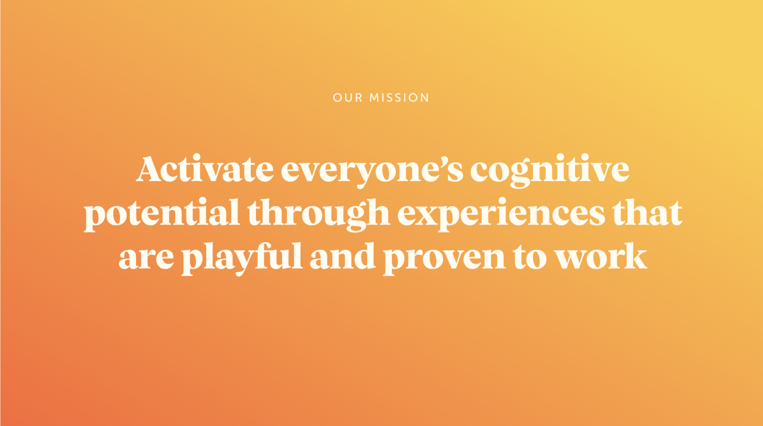
Craft a compelling vision, mission, and position.
Establish brand values reflecting core principles.
Refresh global brand identity, including wordmark, icon, colors, typography, and illustrations.
Create a cohesive customer experience.
STRATEGY
Brand Architecture: Streamlined Lumosity's offerings for intuitive representation.
Vision, Mission, and Position: Refined commitment to cognitive development, unique approach to brain training.
Brand Values: Emphasized innovation, credibility, user-centricity, and continuous improvement.
Target Audience: Identified cognitive enhancement seekers across age groups and professions.
BRAND IDENTITY REFRESH
Wordmark and Icon: Modernized wordmark for dynamism, icon symbolizing growth and learning.
Color Palette: Vibrant yet calming colors for focus and energy.
Typography: Professional yet approachable typography system.
Illustrations: Custom visuals representing offerings and cognitive journey.
RESULTS
Stronger Perception: Revamped identity positioned Lumosity as a brain training leader.
Consistency: Cohesive identity enhanced recognition across touchpoints.
Clear Communication: Refined vision and mission resonated with users.
Audience Expansion: Defined target audience widened user base.
Growth Alignment: Streamlined brand facilitated new product development.
CONCLUSION
We successfully positioned Lumosity as a pioneering force in cognitive enhancement. The revamped visual identity, coupled with a clear articulation of the brand's values and mission, enabled Lumosity to leave a lasting impression on its customers while fostering a foundation for future growth and product innovation.


